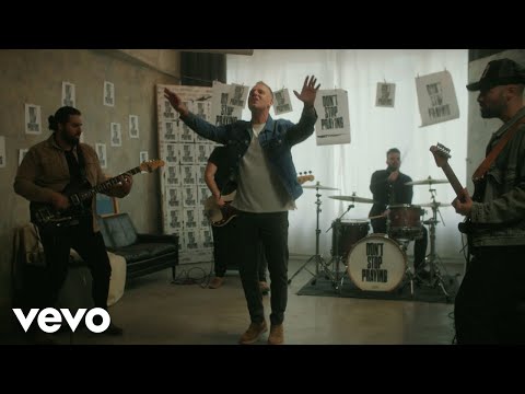
The New Visual Language of Faith-Driven Music
Cover art in the format has moved from stock inspiration to design with a point of view.

A decade ago the visual default for Christian releases was a photograph of a person looking upward, colour-graded warm. It communicated exactly one thing: reassurance.
The current crop reads differently. Typographic covers. Deliberately low-fidelity photography. Lowercase titles. All-caps titles. Design that treats the release as an object rather than an announcement.
Why it matters
In a feed, artwork is the first argument a song makes. A cover that signals seriousness about craft buys a listen from someone who would otherwise assume the category.
The limit
Design cannot rescue a weak record, and the format now has plenty of well-art-directed songs with nothing underneath. The visual upgrade is a floor, not a ceiling.